小狗暖手宝
电商视觉 & 包装设计
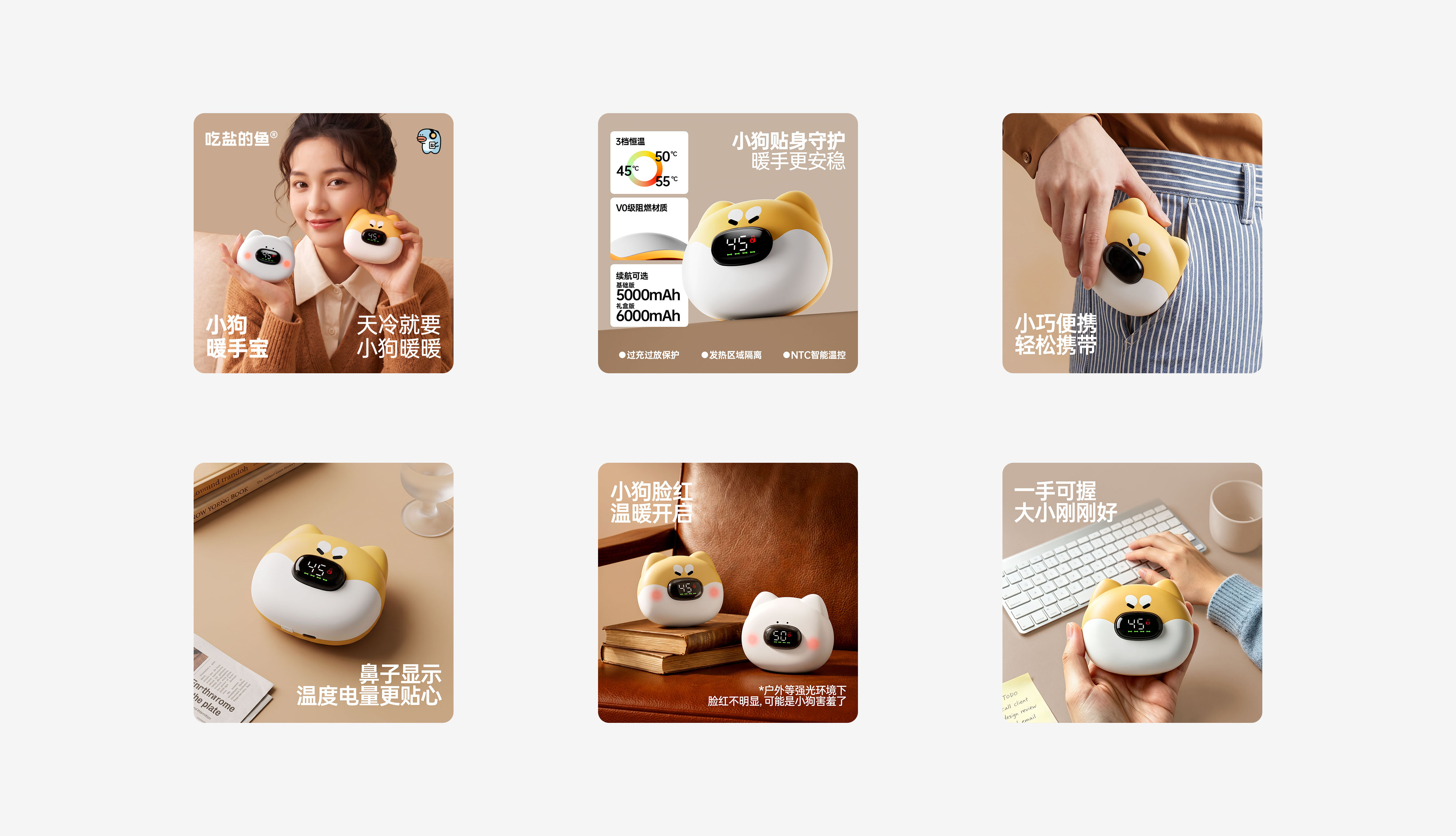
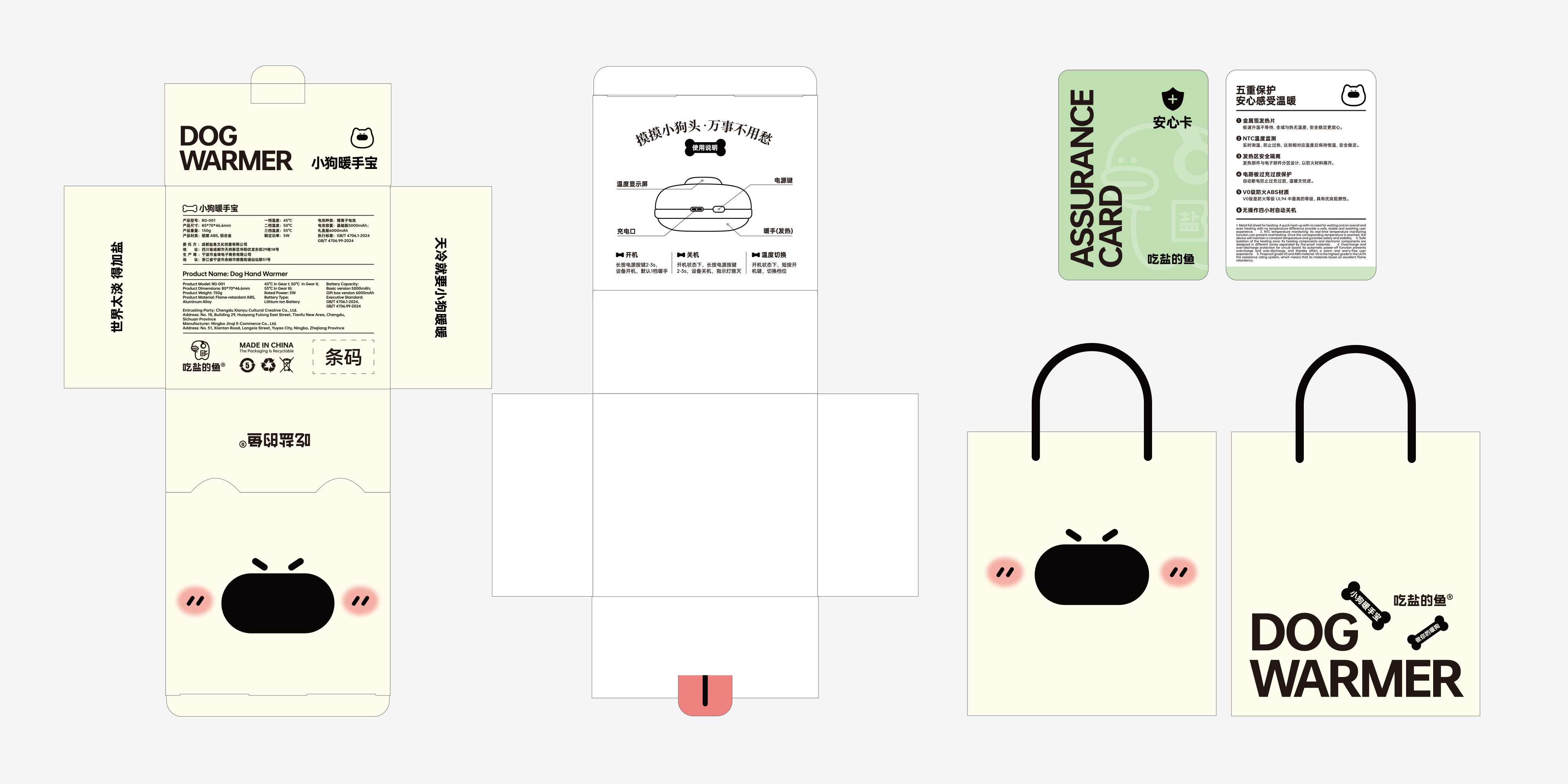
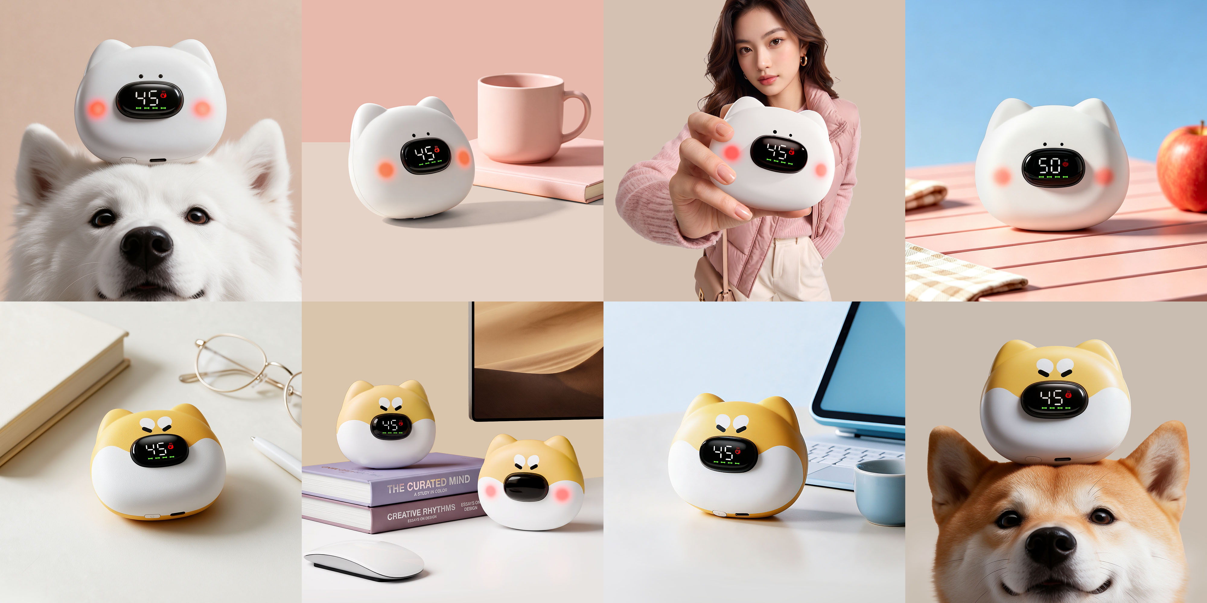
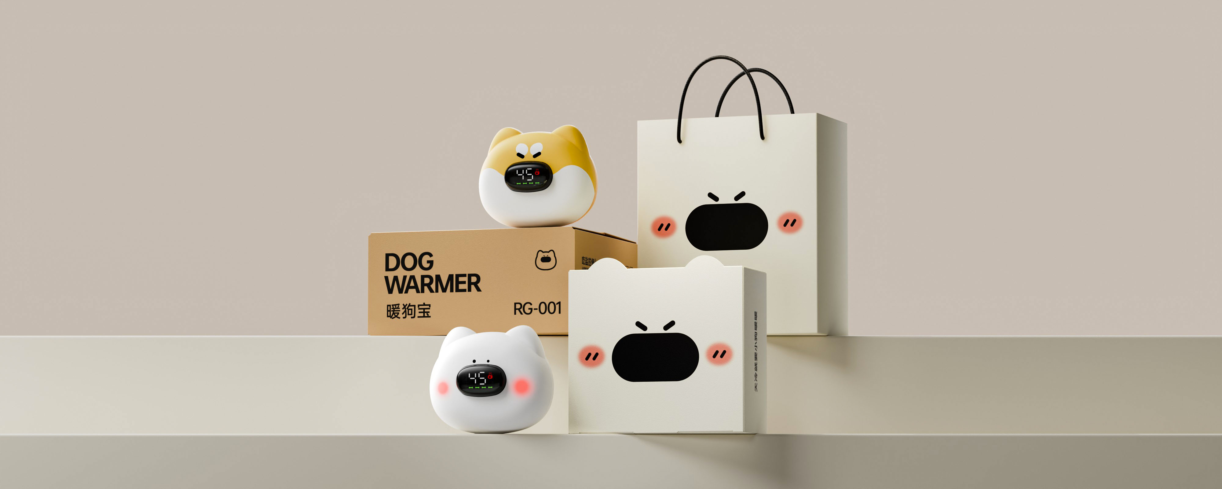
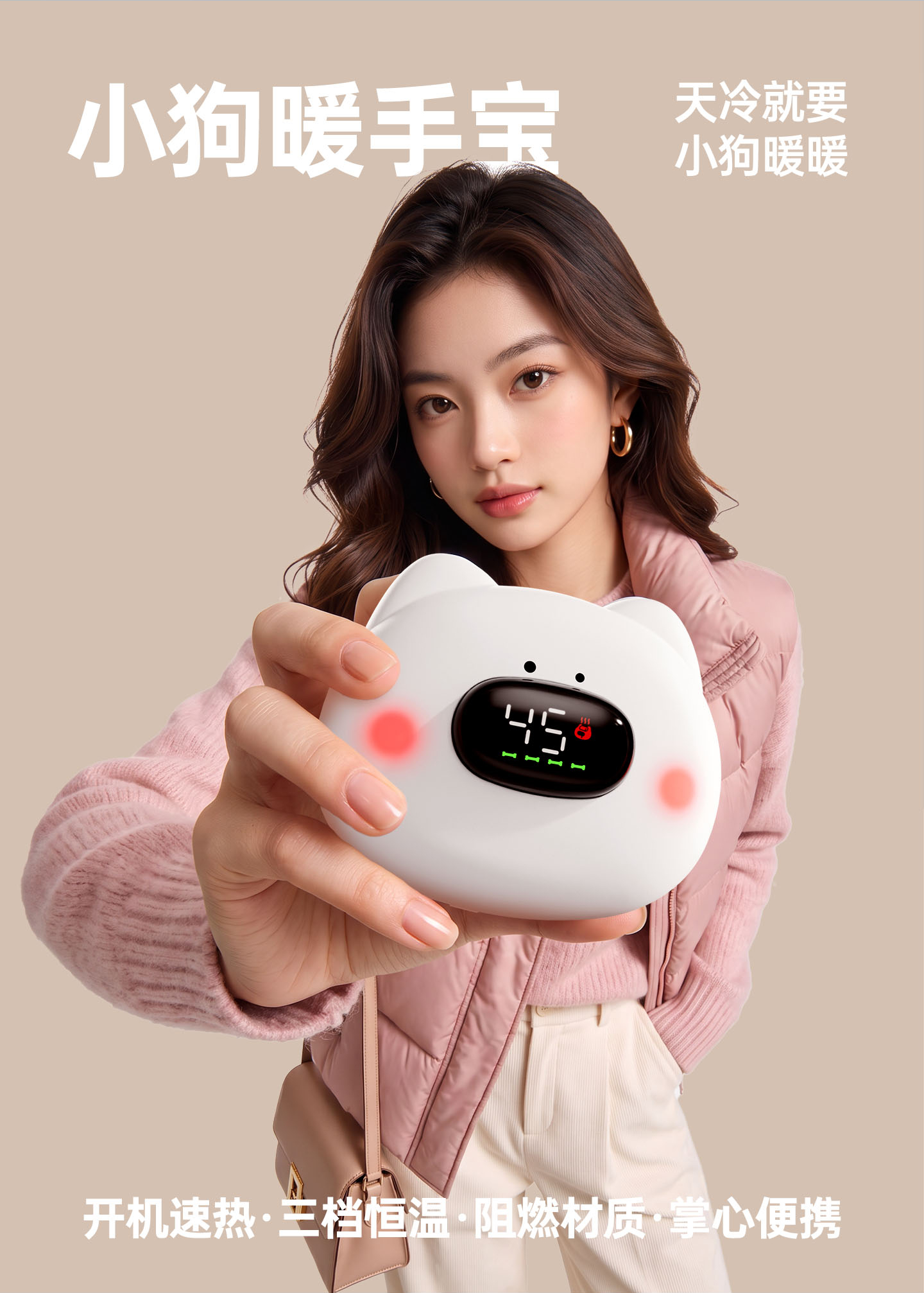
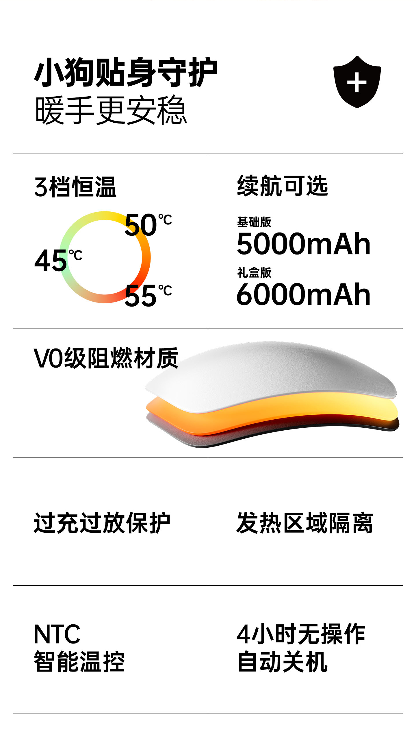
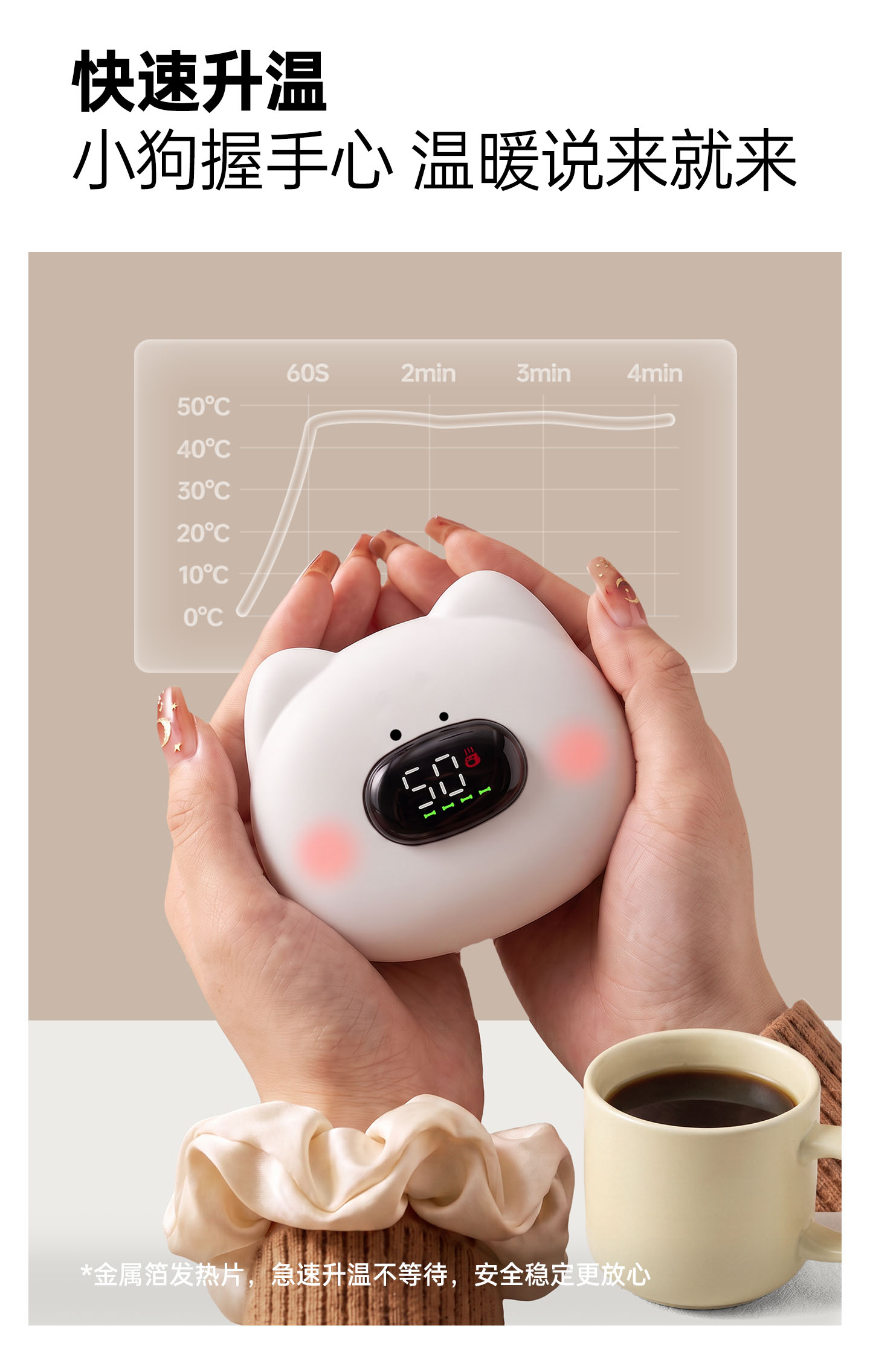
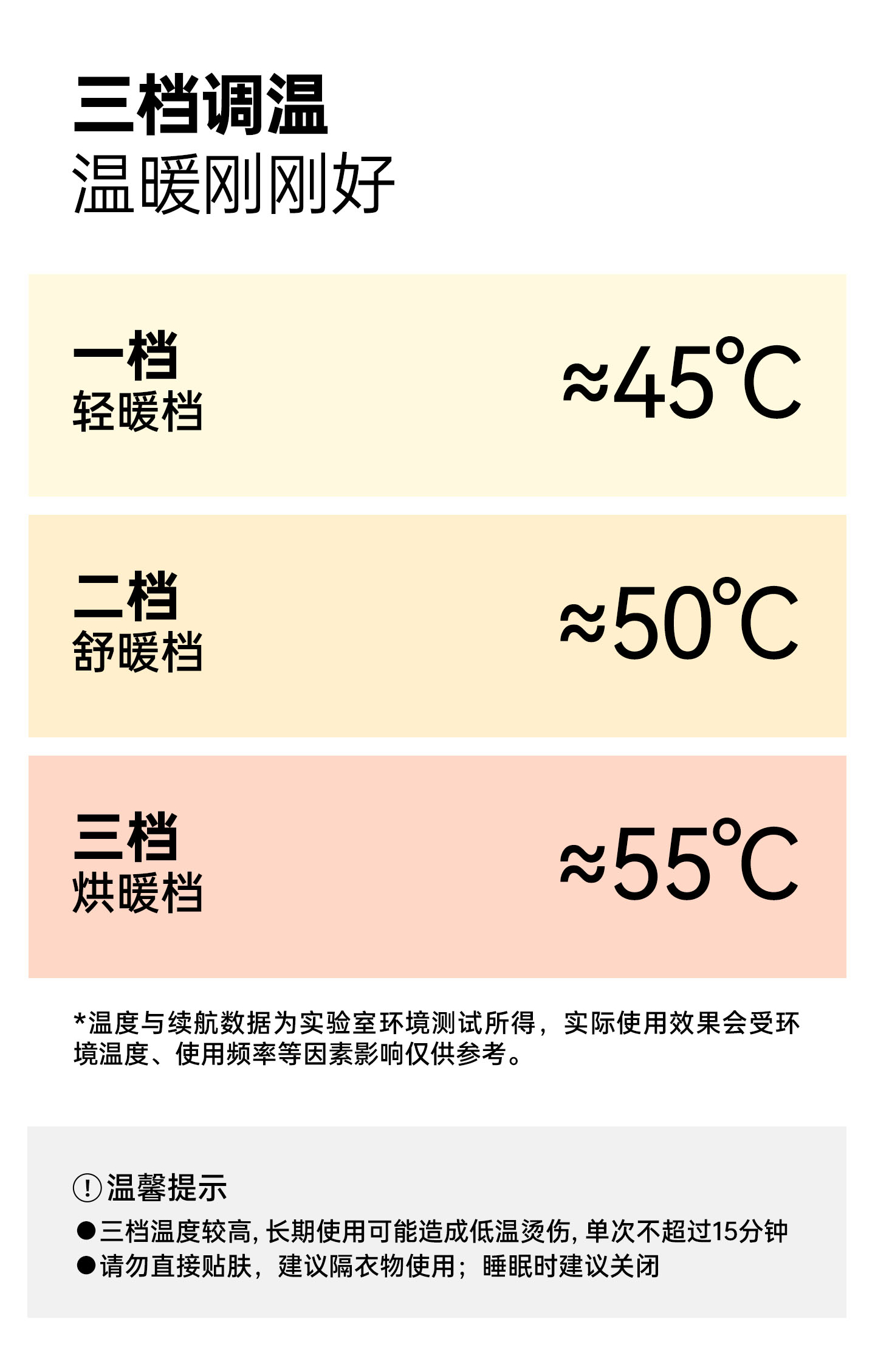
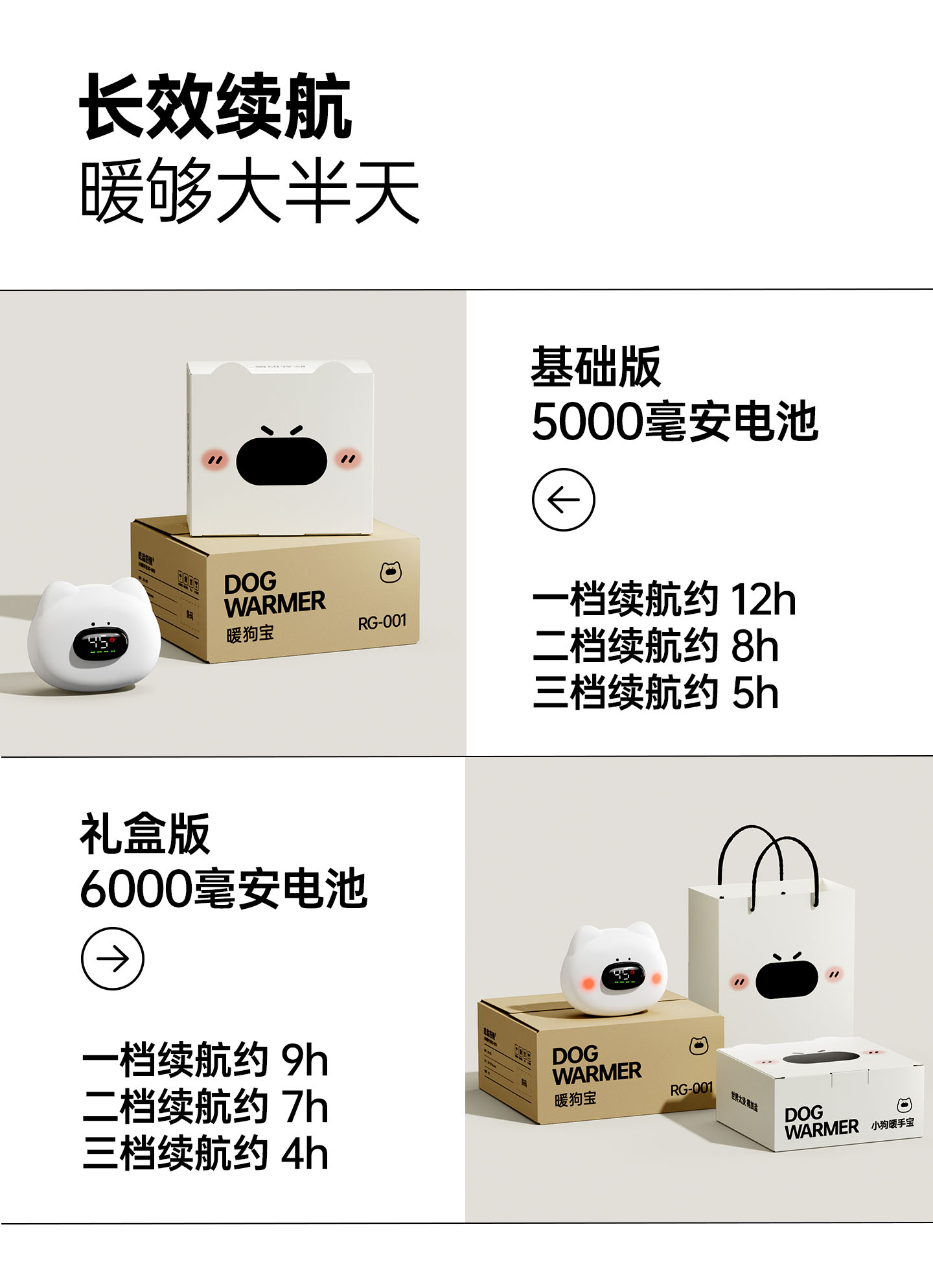
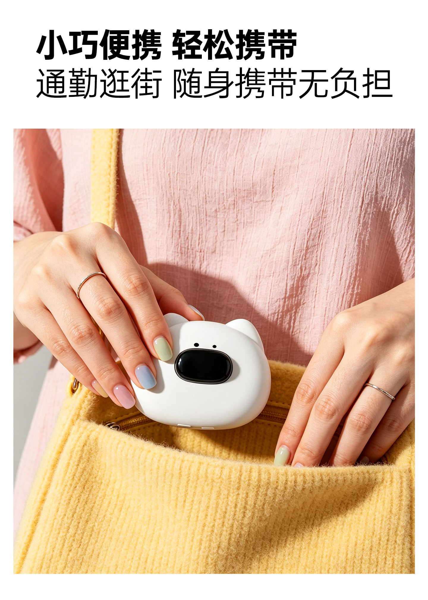
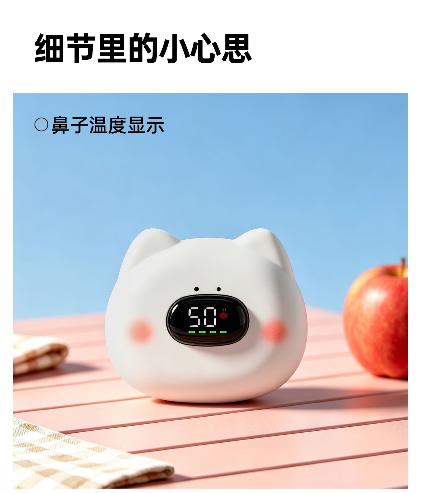
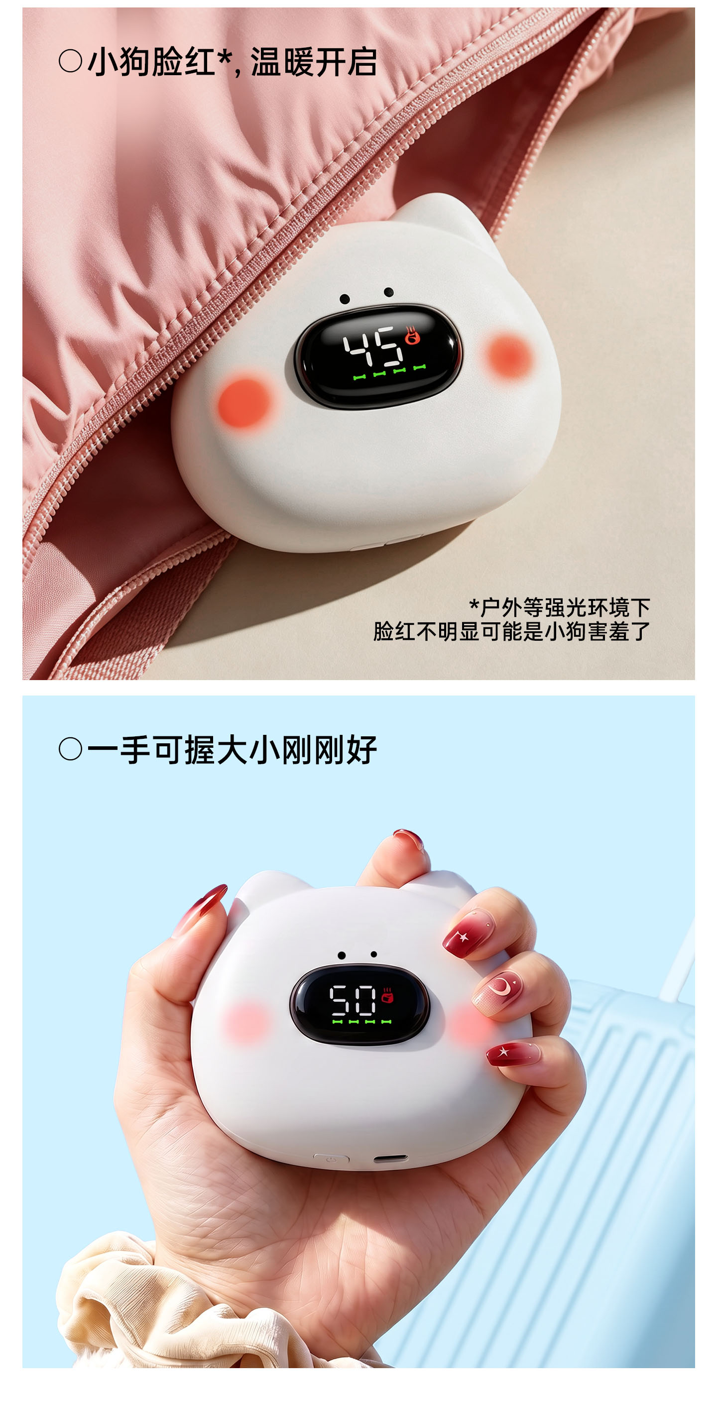
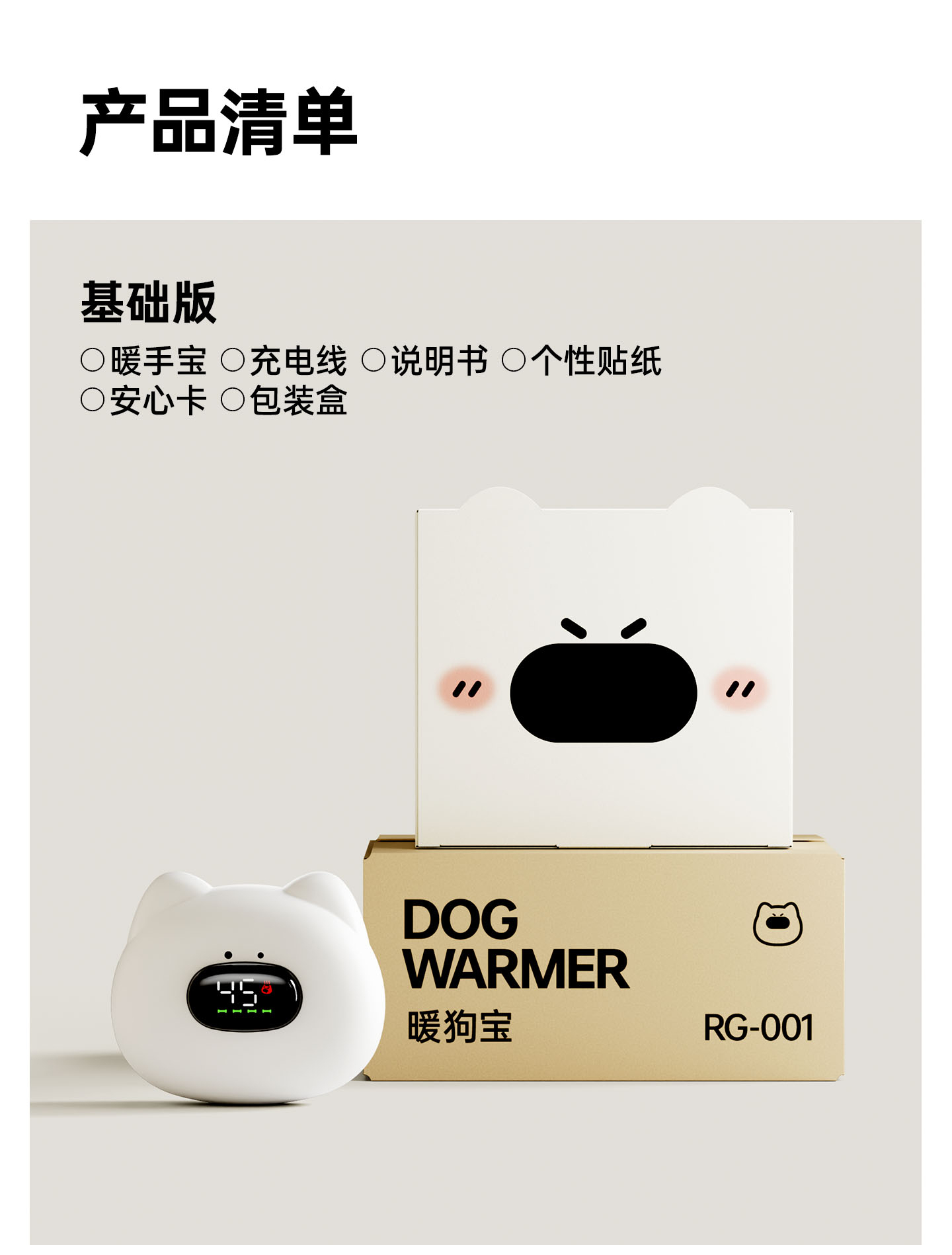
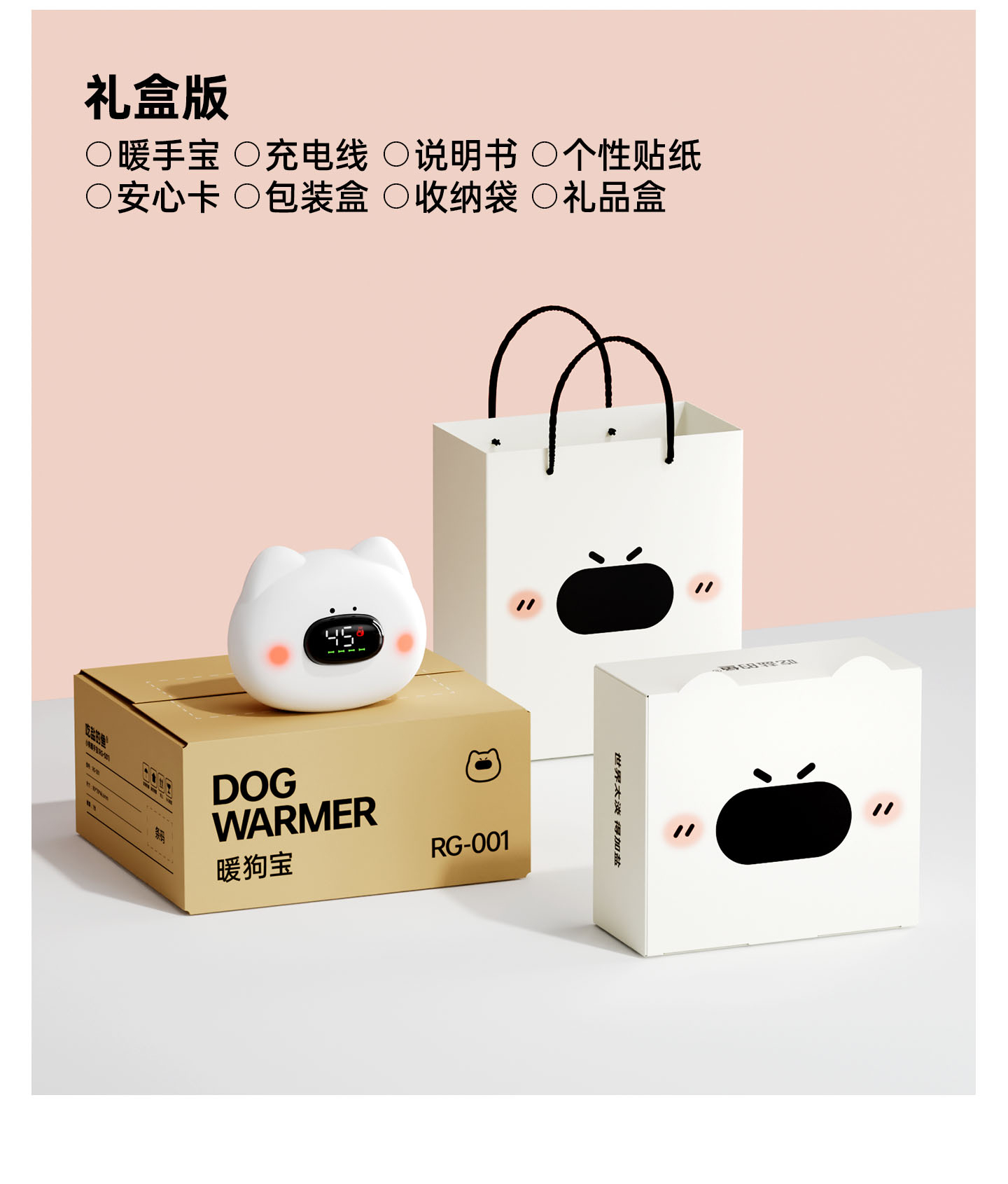
We designed the packaging and e-commerce page for a puppy-shaped hand warmer, targeting young women and pet lovers on Xiaohongshu. These users seek healing and companionship, but have a sharp eye for "cheap cuteness." To bridge this, we made two restrained choices. First, we toned down the "cute" factor with a low-saturation Morandi palette and rounded, minimal design, letting the puppy sit quietly on a desk without being cloying. Second, we assigned distinct roles: the packaging acts as a small gift box, heightening the unboxing ritual and gifting appeal, turning the object into a metaphor for companionship. Meanwhile, the detail page uses a modular narrative to weave together features, scenarios, and emotional resonance. We believe charm and quality aren't a trade-off. The puppy shape serves as the emotional entrance to the entire visual system—ensuring the box, page, and product tell one coherent story.
我们为小狗暖手宝完成了包装视觉与电商详情页设计。设计风格服务于受众,这款产品核心受众是 一群在小红书上成长起来的年轻女性与宠物爱好者。她们对萌宠形象有天然的情感投射,愿意为治愈感和陪伴感付费,却也对 "廉价可爱" 保持着清醒的审美警惕:一眼心动,也一眼能看出哪里在敷衍。基于此,设计策略上我们做了两个克制的取舍。其一,是把 "可爱" 收进低饱和莫兰迪色系与圆润简约的设计语言里,让小狗在桌面上耐看、不抢戏,不甜腻、不喧哗。其二,是让包装与详情页各司其职 —— 包装以小礼盒的体量强化拆封那一秒的仪式感与送礼属性,把 "掌心有一只小狗" 讲成一种陪伴的隐喻;详情页则以模块化叙事串联产品卖点、使用场景与情感共鸣。我们始终相信的一件事:趣味与品质不是二选一。一只小狗造型不该只停在造型上,它应当成为整套视觉的情绪入口 —— 被捧在手里的那一刻,包装、页面与产品本身,讲的是同一个故事。
↕ 可滑动交互
↕ 可滑动交互